When it comes to kitchen decor, you should pick out a style or theme which you can relate to. If you're going up market, you might want to make it look expensive. There's lots of components to this, with colour being one of them.
I want to look at colour. What colours make a kitchen look expensive?
Veranito says A kitchen looks expensive when its colour palette feels cohesive, balanced, and timeless. You can accomplish an expensive looking kitchen using light colours, or rich dark tones that add depth.
Key Takeaways
- Use light warm colours for a luxury feel
- Deep and dark colours add mood and sophistication
- Natural wood tones for cabinets give off a high end look
Often luxury kitchens often use sophisticated neutral tones that allow premium materials and finishes to stand out.

Warm whites, soft creams, greige, taupe, and stone-inspired shades create an elegant foundation that complements a wide range of interiors. These are good colours if you have a small space, as these colours can make the kitchen look bigger.
If lighter colours aren't your cup of tea, deep colours can also create a high-end appearance when used thoughtfully.

Navy blue, forest green, charcoal, and rich espresso tones add depth and drama while maintaining a refined look.
As we've already looked at, earthy greens are the kitchen colours on trend right now, so not only look expensive, but are popular too.
These darker shades pair particularly well with marble worktops, brushed brass hardware, and natural timber accents, creating a layered and luxurious feel.
Add Natural Woods To Your Solid Colour Tones

Natural wood tones are another hallmark of expensive-looking kitchens, and they're something which we've seen coming back in style.
Walnut, oak, and ash cabinetry introduce warmth and texture while avoiding the sterile appearance that can sometimes accompany all-white designs.
Combining wood with painted cabinetry is an increasingly popular approach that adds visual interest without appearing overly trendy.
Kitchen Artwork Colour

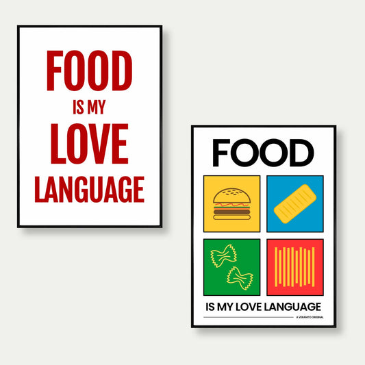
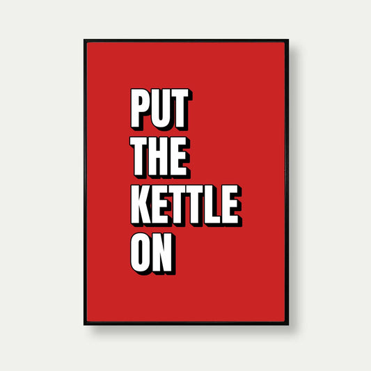
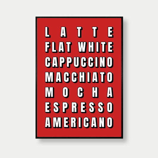
There's something which should not go unlooked which is the colour of your wall decorations.
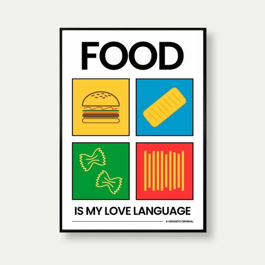
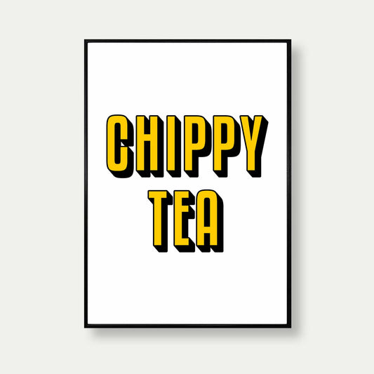
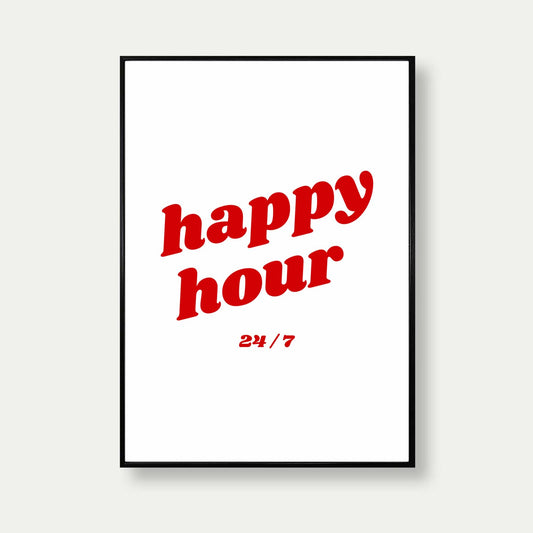
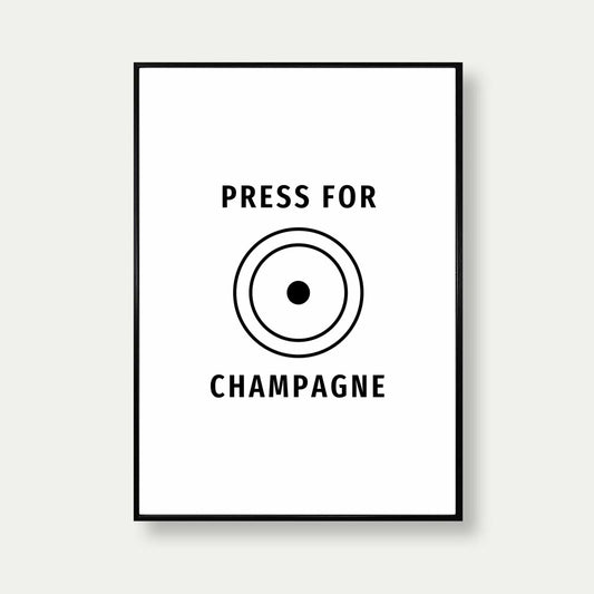
When it comes to art for the kitchen, if you want to make it look expensive you have to choose the right pieces. Not only the right theme, but the right colours too.
The secret is cohesiveness. You need the art on your wall to be cohesive with the rest of the decor, so picking the right colour is key.
If you have warm tones with paint on your walls, a contrasting colour print works well. As we've discussed with rich colours, this can be used within artwork to add an accent colour to the paint on your walls.
You can also go monochromatic, because as we know, black and white is just stylish all the time.
Don't Forget The Finishing Touches
Consistency is just as important as colour selection.
Matching cabinet finishes, coordinated hardware, quality lighting, and carefully chosen artwork all contribute to a polished design.
Even simple kitchens can look luxurious when colours are harmonious and decorative elements are thoughtfully curated.
On that note
Ultimately, expensive-looking kitchens prioritise timeless colour combinations over short-lived trends, creating spaces that feel elegant for many years.
Veranito says pick out minimalist light colours, combine them with deep accent colours and add finishing touches such as real woods and metal and you're set.